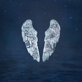
At this size viewers can see that the image used for the cover of ghost stories loses a lot of its detail, detail that can no longer be appreciated for its artistic value, for this part of the project a complete redesign was necassary to show that enlarging detail is not the only option for more suitable thumbnail covers.
The plan was to image trace the shapes then add some texture but while doing this it was cleer that the detail of the feathers would not work at a small scale either. This lead the project in a new direction as the researcher decided to draw the essential lines of the wings on illustrator.
Varied strokes helped to lessen the child like feel that the original stroke had. It alo made the designs more true to the nature of feathers.
The project decided to take on a blue colour scheme similar to the original design but brighter for increased legibility.
A lot more frames were used for this gif to give it a smoother flow and feel.


No comments:
Post a Comment