Rational
This brief is for the ecommerce website Irax. The company has asked for a website update as their current one is not as functional or elegant as they would like. The current website will be analysed in this project and a new website will be designed. During the process constant feedback will be received from the clients as the designer is working within their Irax offices. The decision to work in the Irax office was a personal decision as closer contact and constant feedback allowed the designer to respond in the most effective way.
Brief
The time scale of this project is two weeks so sufficient planning and preparation will be done to complete the website in that given time. The project involves design crits with company members. verbal feedback is an ongoing process which will be documented thoroughly too.
Project Plan
This project is front end design only and no coding was necessary but coding was to be kept in mind whilst designing. Simple graphics needed to be utilised to achieve good SEO and ease of coding however since prior experience is minimal it seemed sensible to research what pitfalls to watch out for. During the planning of the project it seemed apparent that this was a very new environment for the researcher and this made planning the two weeks difficult. Because of this, the designer decided to plan for the first week then judging on how the week went, plan the second on the weekend.
Researching Websites
Since the designers experience within web design is limited, research into what current websites looked like needed to be done. The following research is of general websites that have stood out as particularly elegant and professional looking.
The photography in this website is what makes it look professional it's high quality didn't seem to affect the loading time of the website and a big company like Levi surely considered SEO so maybe designing simple wasn't too much of a concern. The consistent typography in this site added to its professionalism and the use of space in the photography and around the site is well thought out as it allows the information to be read without feeling overwhelmed.
Mcdonald's website uses a lot of space too and the photography is an outstanding feature. This website is even more stripped back and user friendly than the last which is a notable feature that is worth considering when designing for Irax.
Space and photography is used again here. What's interesting about this website is that it utilizes the whole screen available, Starbucks have been clever about this as they know that this wouldn't work on all screen sizes so the information towards the edges contains nothing but an extension of the photograph. This is a nice way to avoid bars of blank page at either side of the website.
The same is done here although not as elegantly as the colour seems to fade into just a block colour. Nevertheless this looks a lot better than having the bars of space at either side of the design.
This is an example where the technique could've easily been replicated but instead the site has chosen to just have blank grey bars that ruin the experience of the fresh green fields.
Researching Other eCommerce Sites
Looking at other ecommerce websites helped to clarify the tone of voice for the project. Friendly and reliable is the impression that Sage Pay gave off. The site uses a few different typefaces all of them sans serif but curved in certain places. This helped give off the tone of voice mentioned. Asside from the typefaces the website itself looks a little generic and boring which is something that Irax particularly wanted to avoid.
This website attempts to show trust and reliability by showing various other companies logos at the bottom. It is uncleer whether these are clients or partners or sponsors but they seem to think paypal deserve two logos. The target audience of this site may perceive these logos as a sign of trust but in my own opinion i think this is a little overboard.
This is a website that differed from the previous sites researched because it did not include any photography. The blue colours successfully connote trust and the use of white space makes the site look clean and functional. It does lacks personality which is something this project needs to avoid and the colour scheme is a little bit boring which is again another pitfall this project must avoid.
'Griding' Websites
Defining the grids in these websites really helped to clarify that grids are just guides unless some extremely complex grids were being used. Lots of elements in these sites didn't fit to a grid and they didn't look awful. This process also helped clarify ideas for grids used for Irax.
Iconography
During an informal conversation with the client the project looked like it was going to include icons. This was something the designer is completely new to so research was necessary. The following tutorial helped clarify a lot of the common mistakes and what to avoid.
Irax's Current Site
It is immediately obvious that this site is in need of tweaking and bringing more professionalism into the design there Isn't much colour and the space isn't utilised to its full potential.
Having too many menus is extremely overwhelming and when one menu item turns into six the website becomes more of a task than an experience. The project needs to consider this and think about user experience so that users can get to what they want with minimal clicks.
It is clear that Irax needs to be a bit more up to date and take more consideration to user experience and with this being their only website the company also needs to consider mobile friendly designs.
Initial Response
An annoying habit of my own is to respond to a brief immediately without doing much research and without planning. I have learnt to accept this and just do it without expecting amazing results. There is an advantage of this as it gives me a place to start.
Immediately there are improvements the colour scheme works better and the space is used better. The design may have used too much space, now that research has been done it is clear that considering all screen sizes need to be done
Already there is value in photography but from the research done better use of photographs can be undertaken. The Icons used here are disproportionate and don't work as a set which is something that needs to be happening.
The icons used at the side of the designs work well and help give the page some flavour and diversity. The menus at the top are okay apart from where the type changes colour and almost becomes illegible.
This page is very boring and uninviting which went against one of the deliverables of this project.
A style guide was created as I would not be coding the website. This is definitely subject to change as in retrospect the colour scheme could do with brightening up a little.
Mock ups
The decision to design something straight away was not all bad as said before it gave the project a starting point and it also gave the client a vision of what could be done. Using these mock ups an informal crit was held to discuss what direction the site was going to be heading in.
The First Crit
The first crit with Irax took place in their office, they did not expect any mockups at this stage just ideas so they were surprised when they were shown physical work. The feedback received was very helpful they wanted more colour and some continuity to their other site: Paybeagle. They also wanted a more friendly look. Speaking to actual clients was difficult as they didn't really know what work had gone into making the pictures however they were very patient, helpful and understanding when it came to advice for development.
Icons
The first thing that seemed apparent with the initial response was that the icons designed were disproportionate and did not work as a set. Using a grid to keep the height and width of each Icon the same helped to improve them.
Even after using the grid the icons still didn't look great. So the project took the Iconography tutorial's advice and went back to the start.
Drawings were done first.
Keeping a sketchbook at hand was essential to note down ideas, Hex codes, mock up layouts and make notes for the final style guide.
Using adobe kuler a color the project created a colour theme that could be modified to give a range of colours and fit with the Pay Beagle website.
The orange used here in this colour scheme is the exact orange used on the pay beagle logo and website.
The Icons created were based off the drawings, doing drawings first did make the process a lot easier.
Even when the icon created was a good representation of the drawing a lot more tweaking and alterations had to be made.
Adding a reflection made the icons look like they were on a surface which looked good however the client thought otherwise.
Using the same colour scheme and the same width and height of the previous icon the project started to generate other icons for the other services.
It was very hard to incorporate the skin tone colour of the pig with the other icons so the decision to remove the pig from the accounting icon was made.
There were various points during these icon creations were they were tested in context to see what they looked like.
Making a phone shape was harder than it looked so a bird's-eye-view of the phone was created instead. It took until all the icons were done until the designer realised the number 0 was missing.
Without the skin tone and with practice and trial and error the icons started to come together, the biggest problem being to trying to keep the amount of whitespace consistent.
Accounting Icon redesign
Scaling up the illustrations brought problems, the edges of the colour started to retreat and show white space but the stroke stayed the same. it seems sensible to work to scale.
This was a design board made to show to the clients and to send to classmates for feedback.
From this the phone systems icon (Number 4) was obviously in need of amendment for a start there's 10 numbers on a phone not 9... it was also suggested by some classmates that the partners icon (number 7) didn't fit as well as the others.
Finished Icons
After showing the owners of Irax my work they decided to scrap phone systems from the website as it was something they were working on but couldn't offer their clients yet. This was a point where the designer suggested that future work from Irax should be directed to himself to keep continuity to which the Irax staff members reacted positively.
Redesigning the Irax Logo
The colour scheme created for the icons did work with the original Irax logo and the designer thought that it needed brightening up. It was surprising to find out that the colour of the logo they were currently using wasn't a printable colour. This was one of the amendments made as well as improving the kerning and shape of the glyphs.
Layout
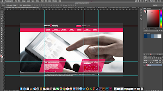
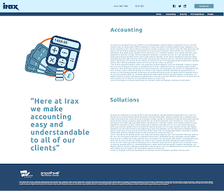
This is an example of an information page which is a page where Irax explain their service solution. there is a page like this for each of Irax's services.
Finished Pages
It would be a lot easier to just link to the finished website but unfortunately Irax are still in the process of making it live. The text on some of these pages might seem like a bit too much but the amount of copy used when designing was to overcompensate for when irax actually decide what they want on their website.
Final Mock-ups
 |
Evaluation
This brief provided excellent experience and knowledge of the industry, for two weeks I worked at Irax creating, discussing and evaluating designs. I was given the opportunity to be paid for doing graphic design which was a new experience and working in house was also a new experience. This brief taught me that clients aren't easy to work with and that design is often unappreciated by businesses in the real world. However the brief was executed well, I created icons for a website that linked to one of the clients other companies, I used stock photography effectively and was able to choose a photograph that accurately represented the company. I had to manage my time and effectively produce graphics to a deadline whilst also maintaining a good working relationship between myself and the client.


No comments:
Post a Comment