Rationale
The rationale behind this project was to potentially create a project that would provide experience and professional live briefs throughout the year. If the proposal was successful the creative networks event's artwork would be our responsibility. This opportunity will allow us to treat the event organisers as clients and create a real working relationship. It also gives students, teachers and guest speakers a chance to see our work in context.Proposal
The future of colour event
This event was lead by Declan and he delegated the job of vinyl display to me. I had already sorted the vinyl for the first two events so all I needed to do was re cut it in a different colour.
 For the first three creative networks the vinyl on the floor reflected our frame concept whilst also reflecting the term networking as each frame shape was connected to another
using a meter in between each frame shape allowed the shapes to be placed quickly without worrying if the vinyl strips would fit.
the serif vinyl was a challenge as it was extremely hard to make the parts we wanted to stick down stick. This taught us that sans serif typefaces are much easier to implement for these events.
on each of the first three events the vinyl stretched all the way to the lecture hall.
No posters
For the event the team had no printed posters ready for the event.
This meant that we had to do something makeshift quickly so to reflect the ripping nature from the pre event posters for this 'future of colour event' we ripped up coloured paper and used them as our posters instead.
Giles Deacon Event
For this event we approached printed textiles and asked them to submit their illustrations so that they could be placed into our posters and their fashion work could be seen by fashion speaker Giles Deacon.
Crit
During a crit with Josh and Louise myself and the rest of the group agreed that the above posters lacked colour and resembled christmas a bit too much so we changed our designs to the ones below.
These designs definitely reflected our theme of framing a lot better. The colours chosen were all complimentary of the illustrations or a colour was actually picked out of the illustrations.
We displayed this poster to welcome the guests. the poster was to reflect our theme of framing the guest speaker.
Andrew Graham Dixon
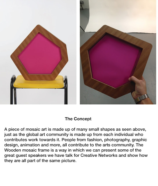
Andrew Graham Dixon was the first guest that Creative Networks hosted Research showed that he was an art critic and has been on various art related documentaries on BBC. Our concept wrapped around AGD and created a system where guests could be placed within the frame, the name changed and this would generate new work.
It was clear from feedback that we needed to add more to the event to make the relationship between the speaker and the artwork stronger. You can see that this feedback was implemented when the giles deacon talk was executed.
To match our 3D theme we laser cut and blue tacked typography to the display wall behind the bar.
We had to spray paint the wood to make the typography more legible against the white background.
Will Aslop
For the final event the college will be hosting Will Alsop a artist and architect who, from research sources, apparently paints buildings and then turns the paintings into buldings.

Here are a few of his buildings that he has created as you can see the buildings look quite futuristic with the windows being very abstract shapes.


We started off by brainstorming what we could do and came up with a concept that relates back to our original concept of framing only this time the frame would be window frames and inside there would be information about the event. We had to move quick for this project as the event is actually after our submission.

We quickly set up files for laser cutting and mocked up a poster for the event as you can see below the poster made of paper, foam board and perspex resemble will's buildings incredibly well.

From the laser cutter we were left with many interesting shapes that linked to the shapes created from Will's buildings.

We used these shapes as further advertisement for the event.

We tried to place the advertisments in obscure places where students (the target audience) would clearly see them. We did this by placing them on entrances and exit doors.


Finished Posters
As you can see from the images below we have taken inspiration from Will's artwork and produced posters in a matter of days that reflect the artist and architect very effectively.
The colours are selected from his paintings and slightly tweaked to improve how they compliment eachother other.
The typography used Was Futura as it was a geometric font that effectively linked to architecture due to its links to the square triangle and circle shapes. Futura was designed with these shapes in mind and these shapes are the basis for many architectural structures.
Evaluation
Creative networks provided a great platform for myself as a designer to shine, the four projects that myself and two others have created have allowed us to be noticed and respected as designers who can meet deadlines and build strong working relationships with clients. We were always involved, hands on in creating the events we would decorate the building and tailor the design to each guest speaker. The first event (Andrew Graham Dixon) was a simple execution of our proposal which from feedback was said to lack personality and needed to reflect the guests better and be more colourful. We executed the next event with this feedback in mind and also experienced a collaboration with many Printed Textiles students who submitted their fashion illustrations for us to manage and add to the posters. This gave us experiencing with setting deadlines and chasing up information and work.
The next event caused complications and was in my opinion an unsuccessful event, we executed the vinyl well but with no posters being printed for the actual night the event looked as if it was missing something. On the flip side the pre event posters created were extremely strong for this event and engaged students by letting them reveal colour by removing perforated parts of the posters this was appropriate as the event was about colour. This third event also caused our concept to get lost, the frame proposal we used for the first two event worked well but with time as a restriction and three guests speakers being involved the concept didn't work. We would of had to have made two other frames which was something that time didn't allow us to complete.
The fourth event was lead by myself and was an event based around guest speaker Jonathan Barnbrook a separate evaluation for this brief will be written and included with submission. The last event is actually set to take place on the 26th of May which is after this submission so only the pre event materials and work are included. The graphics created for this brief though are effective and reflect Will Aslop as a designer and architect whilst attracting students.


No comments:
Post a Comment