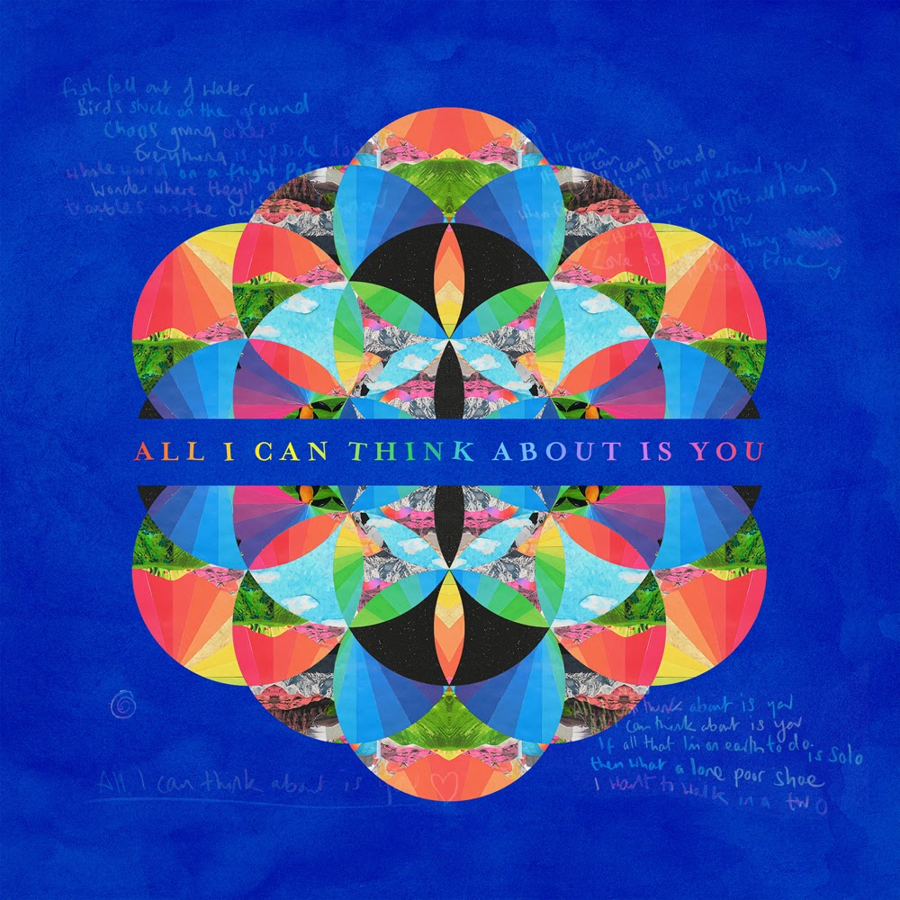
Creating the Flower of life
How hard could it be to make the 'flower of life' symbol that coldplay are using for their new album A Head Full of Dreams? Turns out its not as easy and simple as it looks. The symbol despite its simple look is very confusing to look at and figure out where each circle is supposed to be. After figuring out the pattern a grid/guide was used to place the circles.
The grid made the design process a lot easier and the symbol soon started to come together. The only issue with this point was making sure the circles intersected with each other correctly to form the flower shapes.
Creating a gradient using 30 degree increments in the HSB colour option with a distance of 8.3% between the colours. This was done to achieve every colour possible on the colour wheel.
Adding the gradient.
To get the angled gradient that Coldplay use was difficult. Illustrator only allowed for linear or radial gradients and none of these worked.
Applying the gradient to the stroke instead gave the results intended but this left a giant black hole in the middle of the design.

Bulking up the stroke seemed to solve this problem. There was still a very small black hole but this was hardly noticeable. Illustrator has a maximum stroke of 1000 so the circle size had to
be reduced slightly.
Using the 'minus front' option in the 'pathfinder' window gave a negative of the shape created so that the gradient could shine through. I kept a copy to use for making each circle individual later.
This gave the design a nice look and the symbol that Coldplay use was achieved.
plugging up the black hole.
My design.
Coldplay's design.
The reason for going through the trouble of replicating this symbol was to learn something new and to give the design a lot more freedom when it came to making the Gif.
There were also a few mistakes along the way that produced serendipitous results like the one above. This would never of happened without creating the symbol myself.
There were a few unhappy coincidences too like the unexpected glitches illustrator produced when creating compound paths but this was easily avoided by grouping the circles instead.
Another cool coincidence.
Next the symbol was turned into guides so that I could create cut outs for each of the individual circles using the 'minus front' option again
Illustrator did not like this so I decided to try and make a moving image in After Effects with what I already had.
using the scale and transparency settings the video below was produced.
I was quite disappointed with the results especially the quality of the render so I decided to stick with the original plan but use photoshop instead.
Looked up what size to work at for Itunes Artwork
followed a tutorial for creating gif's on photoshop.
Then using the selection tool and inverting it individual gradient circles were produced.
I used another red symbol as a template to make sure the gradient circle was in the right part of the hue circle.
many circles later the design looked no different but was made out of individual circles which gave the design a lot of freedom when it came to making the gif.
Deleting excess gradient.
Lots and lots of circles.
.Gif Creation
Each circle was made to be its own layer, using the timeline feature on photoshop several gif's were made that deconstructed the 'flower of life'.
This was the first gif produced, there were a few mistakes and keeping track of all the circles was difficult. This gif was a bit too complex and experimental, the growing circle looked a little out of place so I tried again.
This time the gif made was shorter and less complex. The spinning at the end really works and the results were pleasing. However, the starting frame wasn't as legible as other 'thumbnail' ready designs.
This was a screenshot of the centre of the symbol. Its colour and boldness really stood out compared to the thumbnail below which was the first frame of the second gif.
Thumbnail of second gif. Because the idea of this project was partially inspired by 'live photos' the new technology in the latest iphone (6s) the still thumbnail needed to look clear and recognisable.
The screenshot of the centre of the circle works well. Put next to another 'thumbnail' ready design one can see that it would work well on iTunes.
The gif thumbnail did not achieve this same impactful simplicity. if it was larger it would work so whilst combining the look of the image below with a larger circle the final gif was created.
A Head Full of Dreams .Gif
Thumbnails that could be used. The one on the right is a lot more impactful but now the circle is larger on the left one, it works well too.
Coldplays album cover in the top left corner.
My redesign.
The smallest thumb nail to the left is surprisingly still too complex the design I have done works well for other sizes but not too well for the smallest thumbnail. Especially if you look at Ed sheeran's album design at the bottom. I wondered if it was just because coldplay was highlighted which is why burn the priest's album cover is the same.
by simply cropping the original thumbnail a new much more recognisable and legible image was produced. This design fits much better in the extra small thumbnail view.
Designs In Size Order
Record / CD album art
Large digital thumbnail art.
this is where the gif would
work too.
Small thumbnail art.


Great project. So glad to find this. I want to use the logo as part of a present and can't find a version in high resolution (print). Would you upload one or share the psd/ai file? That would be so awesome.
ReplyDeleteAwesome work!
ReplyDeleteque app utilizou?
ReplyDelete