Research
Research for this brief started looking at obvious religious symbolism like the cross and the bible. A design that influenced this brief was the simple logo for the “museum of the Bible” this logo is simple and friendly and the simple action of turning a “B” on its side created a subtle yet effective symbol for a bible. Simple clean illustrations were also researched when thinking of the Sunday school, this was to try and capture its friendly connotations. Script hand rendered typography was also found to give friendly connotations.
Development
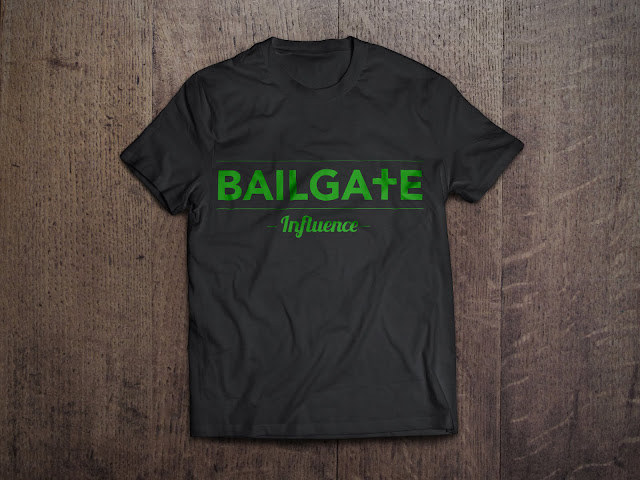
Bailgate church needed a logo that reflected the Christian religion, ideas of making the “B” a bible like the logo researched was thought about. Putting the logo on a hill like the stereotypical image of a cross on a hill was thought of but the main idea was simply moving the crossbar of the “T” down to make a cross shape. This made the logo give subtle connotations of a church and religion. The colour thought of was green as the Christian religions 7 days of creation came to mind. Creation is best represented in colour as green as it symbolises the land that Christ made.


Two of the ideas were developed, the hill idea and the cross. The cross was stronger and gave better connotations of a church and religion so this idea was developed the most. The blue colour was another colour that represented the seas that were made in the 7 days of creation and the white gave connotations of purity. When it came to the sub brand influence the colour would follow the main brand colour, this meant that typography was the only concern. Script lower-case type suited the friendliness and eventually a script typeface was chosen that fit with the main font and also lead the brand in a less neutral and more friendly direction.
Final Ideas
These ideas meet the requirments set out at the start. The lowered crossbar of the letter “T” connotes the christian religion and subtley yet obviously gives the viewer the impression that this logo is for a church. The script font used for the sub brand “influence” connotes friendliness and shows afun side of the brand, targeting the younger target audience of the church.
Evaluation
This brief was set by a client who wanted to give her church group and sunday school a design flair, she left the brief completely open to myself and let me interpret it how I wish. This brief was great opportunity to practice working for a client. The graphics created for this brief reflect the christian religion and hold connotations of creation which came from the classical tale of the christian belief that the world was created in seven days. The brief was a success as it met all the aims and requirments unfortunately the client didn't want to pay for the graphics so the actual graphics never got used. Regardless of this the brief was executed professionally and provided good experience with handling clients.
Final Ideas
These ideas meet the requirments set out at the start. The lowered crossbar of the letter “T” connotes the christian religion and subtley yet obviously gives the viewer the impression that this logo is for a church. The script font used for the sub brand “influence” connotes friendliness and shows afun side of the brand, targeting the younger target audience of the church.
Evaluation


No comments:
Post a Comment