Research
Individually we all did some research I looked at the branding for Virgin and GWR
DBA came in and briefed us on a branding project. The task was to create a visual identity for the 'new' transport system Hyperloop. Hyperloop is an invention put forward by Elon Musk, a super high speed transport system that travels via tube at close to 800 miles per hour. The selling point being that customers can travel from San Francisco to LA in a matter of minuets.
Individually we all did some research I looked at the branding for Virgin and GWR.
I noticed that it was important to think of the logo in many contexts rather than just on the side of the train via this research.
This research showed that we should consider future uses of our brand and create guidelines for other people to follow to make sure the brand identity is kept consistent.
Once formed into a group of 5 we sat in a room and put our thoughts on paper and tried to get in an open atmosphere that encourages creativity. It was quickly noticeable that a lot of us had already come up with similar ideas. This was something we smiled about and quickly agreed to reject those ideas. it was mutual that originality had to manifest.
- A logo
- A Moving Image
- Brand Guidelines
- A range of mock ups
- A Presentation of the new brand.
- Lanyards (for staff)
The group established that legibility was one of the key elements in the project. This being decided several Helvetica fonts were printed out whilst also using post-it's to draw Logos. the fonts and post-it's were then paired up to view what logo went with what font.
Dba Crit


As group we presented our initial sketches to the members of the DBA, they liked our ideas behind getting from A to B and told us that our logo should reflect this strongly. They also told us that our idea to change the name should be scrapped. Although it was disappointing hearing some negative feedback, it was motivating and the group took on board the advice to push the concept of getting from A to B.
This is a gif of the main designs that the group tried working with, eventually we decided upon the logo with a gradient of blue. The colour was chosen as it is the most natural and 'country friendly' colour the group could think of. We thought about using green but didn't want to give off a greenwash impression. The gradient was chosen to bring more life to the flat design and to give the brand a range of monochromatic colours.
The symbol of the logo which contains the colour is a representation of speed togetherness and reflects our main concept of A to B. The symbol looks very similar to the merging of two 'pins' used in google maps.
This was a conscious decision as the connotations of this shape already connote location. our logo merges two of these pins suggesting that hyperloop connects two locations. the group intends to reflect this via the moving images of this symbol showed later on.
The logo also looks like something has just been stretched and also like 'U' shaped tube lay on the ground. The stretching could represent time but that was not intentional.
This is what the group decided on as our full logo the ''transportation technologies'' is shown in certain scenarios depending on the context. This is stated in the Brand Guidelines.
Before the final decision on the logo was made we made a loading animation for one of the old symbols. We liked the style of this animation and intend to replicate it with the new logo.
We decided against this logo because if you turn your head to the side it looks a little bit like an alien and although the circle was meant to represent the world and the waypoints a cut through, It wasn't very obvious. We decided to strip back.
Here you can see the finished logo working on uniforms as a badge. As a group we thought about context while we were designing. We thought about what employees of Hyerloop would look like in terms of uniform as they themselves are extensions of the brand.
We pictured ourselves as new Hyperloop employees and because we couldn't design uniforms we decided to design lanyards.
At first we made a pattern out of the logo but feedback suggested that we were using the logo too much so we decided to introduce some new graphics to the hyper loop brand.
We thought about the tubes that Hyperloop use to transport passengers and tried to demonstrate these by creating two lines. Keeping the lines exactly parallel and italicising them helped connote movement, an idea to change the angles of these lines so that they would eventually meet was experimented with. The idea behind this reflected our logo of two locations coming together.
We thought about this as an alternate logo but the group disagreed.
Development of Lanyards
Development of transport tickets
As well as lanyards tickets were a massive part of the Hyperloop brand as these would act as memorabilia for the travellers. These tickets needed to reflect our concept of getting from A to B.
Final Ideas
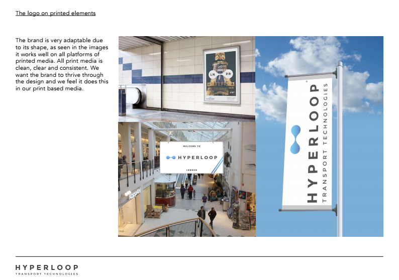
Below are a few mock ups of the finished brand working in context.
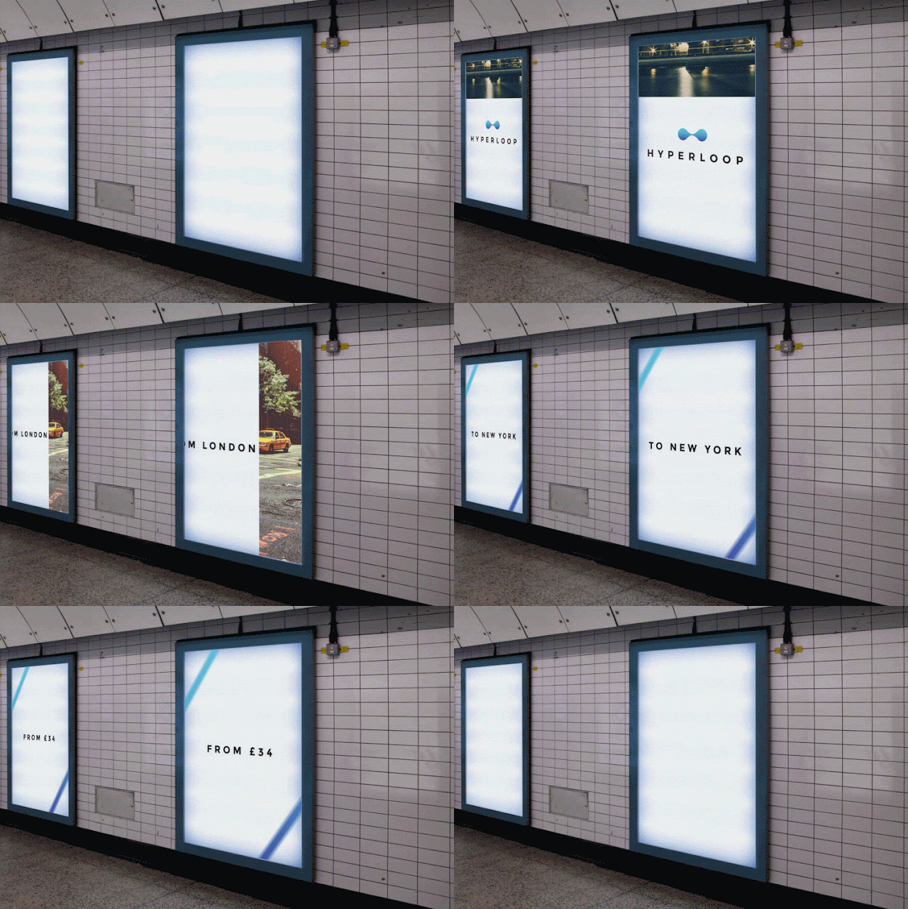
Animated advert mock up
We thought about campaingns and advertising and decided to make an animation showing how the brand would connote two locations coming together via advertisments. Here you can see an animation that connotes speed and two things coming together, the blue lines come together and shoot across the screen to connote this.
Above are the finished tickets that the group decided on. We decided to use an outlined shape of the logo and incorporate a short hand for the states in America. It is true that America have two letter abbreviations for all their states as well as three.
Since Hyperloop will be a thing of the future we thought about what campaigns could be in five or ten years time when the transport system would actually be in use, We realised that technology and mediums for design could be fully digital and that facial recognition is only going to get better so we thought of a campaign that would allow viewers to visualise themselves in a new place. A place that Hyperloop could quickly transport them to. We also thought about the brand as a worldwide system here too.
Here we created some brand guidelines that would allow future users of the brand to read and effectively implement the brand. Pages include how the brand should be used and what typefaces should be used in what context.
Here is the brand working on a web presence. The use of large scale city images were used to create excitement and to demonstrate that the brand is a worldwide system.
Here we thought about the two letter abbreviations for America and thought it could work as a worldwide system. This caused a lot of debates but if the abbriviations already existed I think everyone would learn to understand them as shorthands like they learn to understand shorthand for phrases like "LOL".
The Presentation
Evaluation
Working as a group caused a lot of quarrel however this experience was vital to realise the difficulties of group work in the real world of Graphic Design. DBA loved our presentation which myself and Ashley executed and rehearsed in order to make sure our professional correspondence to the DBA members was as professional as possible. They commended our presentation as the winner which has lead to us all receiving a placement at one of their studios which is great for our transition into proffesionals. Working on this brand was a great experience and the group showed that we could create a successful, professional looking brand, whilst following a schedule and meeting deadlines.
Contact from Hyperloop
This brief lead to Hyperloop Transport Technologies actually contacting us and for us to have our first taste of real proffessional correspondence. Below is an email from John Freeman, unfortunately the work that has followed this cannot be put online and can be found with the physical submission.


No comments:
Post a Comment